There are so many possibilities that if you are in the world of UI/UX design like me (20 years and still going!), you might have heard about Hick’s Law. It is one of those fundamental principles that can either make or break the user experience.
But if you’re new to it or need a refresher, don’t worry—I’m here to explain it in a friendly, easy-to-understand way. Plus, I’ll share real-life examples and tips to help you apply Hick’s Law in your designs. Let’s get started!
What is Hick’s Law?
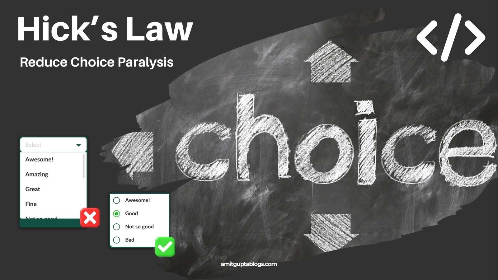
Hick’s Law is a psychological principle named after British psychologist William Edmund Hick. It states that the time it takes for a person to make a decision increases with the number and complexity of available choices. Simply put, the more options you give someone, the longer it takes them to decide.
Think about this: Have you ever stood in front of a restaurant menu with 50 items and felt overwhelmed? Or clicked on a website with endless navigation links and didn’t know where to start? That’s Hick’s Law in action.
As designers, our job is to make life easier for users. Hick’s Law reminds us that simplicity is key. By reducing the number of choices and organising them effectively, we can create interfaces that are intuitive, efficient, and enjoyable to use.
Why Does Hick’s Law Matter in UI/UX Design?
In today’s fast-paced digital world, users don’t have the patience to sift through endless options. They want to find what they’re looking for quickly and easily. Hick’s Law helps us achieve that by:
- Reducing Cognitive Load: Too many choices overwhelm users, making it harder for them to focus and decide.
- Improving Decision-Making: Fewer, well-organised options help users make faster decisions.
- Enhancing User Satisfaction: A seamless experience keeps users happy and encourages them to return.
Whether you’re designing an e-commerce site, a mobile app, or a registration form, Hick’s Law is a powerful tool for creating user-friendly interfaces.
Real-Life Use Cases of Hick’s Law
Let’s look at some real-world examples where Hick’s Law plays a crucial role in UI/UX design.
1. E-Commerce Websites
Imagine you’re shopping online for new sneakers. You land on a website that bombards you with 500 choices at once. Overwhelming, right?
A well-designed e-commerce site uses filters and categories to simplify decision-making. For example:
- First, you select a category (e.g., “Running Shoes”).
- Then, you apply filters like size, colour, and price range.
- Finally, you are presented with a manageable list of options.
By breaking the process into smaller steps, the site reduces cognitive load and helps you find the perfect pair of shoes faster.
Takeaway: Use filters, categories, and progressive disclosure to guide users through complex decision-making processes.
2. Mobile Apps
Mobile apps are another great example of Hick’s Law in action. With limited screen space, prioritising essential functions and minimising clutter is crucial.
Take food delivery apps like Zomato or Domino’s Pizza. When you open the app, you don’t see every possible option. Instead, you are presented with a few key choices:
- Search for a specific restaurant.
- Browse categories like “Meal” or “Pizza.”
- View your recent orders.
This approach simplifies decision-making and helps users place orders quickly.
Takeaway: Prioritise key actions and use progressive disclosure to reveal additional options only when needed.
3. Form Design
Forms are notorious for frustrating users, especially when they’re long and complicated. Hick’s Law can help simplify the experience.
For example, let’s say you’re designing a registration form for a new app. Instead of asking users to fill out 20 fields at once, you can break the form into smaller, more manageable sections:
- Step 1: Enter your name, email, and password.
- Step 2: Add your address and phone number.
- Step 3: Provide payment information.
By reducing the number of choices at each step, you make the form less intimidating and more user-friendly.
Takeaway: Break long forms into smaller sections and use clear labels to guide users through the process.
Tips for Applying Hick’s Law in Your Designs
Now that we’ve seen some real-life examples, let’s talk about how you can apply Hick’s Law in your own designs.
1. Limit the Number of Choices
The simplest way to implement Hick’s Law is to reduce the number of choices you present to users. Prioritise the most important actions and hide or group secondary options.
For example, instead of showing 10 navigation links in your header, prioritise the top 3-5 and place the rest in a dropdown menu or footer.
2. Use Progressive Disclosure
Progressive disclosure is a design technique where information or options are revealed only when needed. This keeps the interface clean and simple while providing flexibility for users who need more control.
For instance, in a settings menu, start with the most commonly used options and provide a “Show Advanced Settings” button for power users.
3. Group Related Options Together
Grouping related options helps users scan quickly and find what they need.
For example, in a form, group all contact information fields (e.g., name, email, phone) together and separate them from payment information fields (e.g., credit card number, expiration date).
4. Use Clear Labels and Visual Hierarchy
Clear labels and visual hierarchy guide users’ attention and make decision-making easier. Use larger, bold text for primary actions (e.g., “Sign Up”) and smaller, lighter text for secondary actions (e.g., “Learn More”).
Conclusion
Hick’s Law is a simple yet powerful principle that can transform your UI/UX design. By reducing the number of choices and organising them effectively, you can create interfaces that are intuitive, efficient, and enjoyable to use.
As designers, our goal is to make life easier for users—and Hick’s Law is one of the tools we can use to do just that. So next time you’re working on a design, ask yourself, “Am I presenting too many choices? How can I simplify this experience?”
By keeping Hick’s Law in mind, you’ll be on your way to creating designs that users love. Let me know how you have solved problems using Hick’s Law in the comments section below.