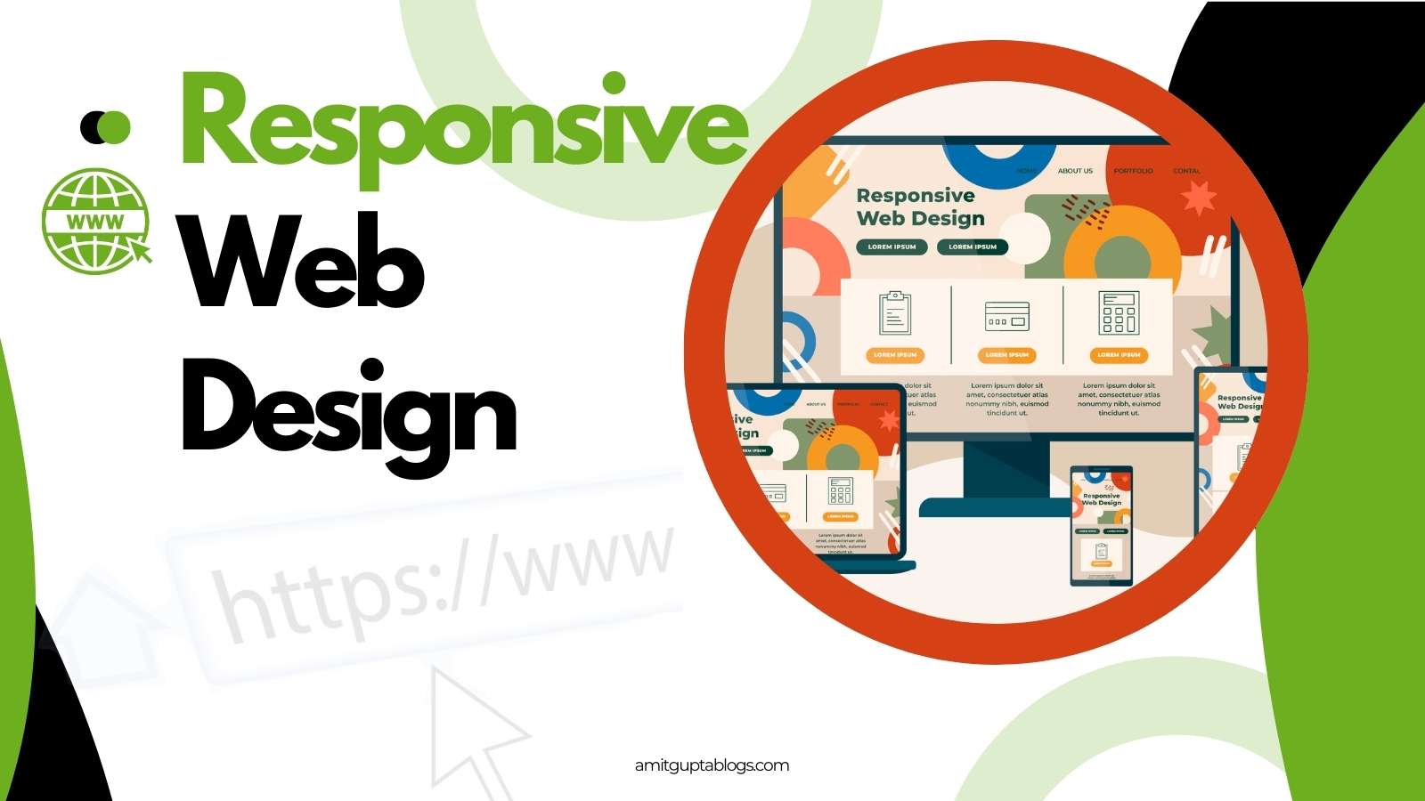
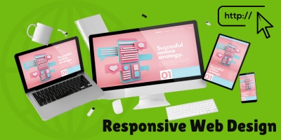
Let’s understand what is a responsive web design (RWD). Responsive web design is an approach that suggests that design and development should respond to the user’s behaviour and location based on the device screen size, operating system, and orientation. This helps the website look good on any device, including desktops, tablets, and phones.
Table of Contents
Why responsive web design matters?
Imagine you are navigating a website on your phone where text spills out of bounds, images overlap, and buttons are nearly impossible to click. So you must be worried, right? The concept of responsive web design is used to overcome these problems, creating a seamless browsing experience.
We should also consider that a user should not have to change the settings of his device. The website itself should respond to what the priorities of the website users are. This will eliminate the need for a separate design and development phase for each new gadget in the market.
But why does responsive web design matter so much? The answer is – user experience, future proofing and SEO friendly.
- User experience:
- A well-designed, responsive site is easy for the user to read and navigate, increasing their satisfaction.
- Future-proofing:
- Responsive web design makes your website work smoothly on all devices that have not yet come to market.
- SEO Boost:
- Last but not the least is Google and its strategies. If you want to rank your website in search engines, you will have to make your website user-friendly and device friendly. Otherwise Google will not give importance to your website.
What are the key principles of responsive web design?
Responsive web design has three main components that work together to create flexibility and adaptability. These components are flexible grids, flexible media, and media queries.
Flexible grids

Flexible grids uses relative units like percentages, em, rem, vmin, vmax , vh and vw. Rather than rigid layouts based on pixels. Just imagine that you fill a vessel with water and it takes its shape. Similarly, your website should also adjust to the container of the device just like water. This dynamic resizing ensures that website elements maintain proportionality across all devices.
Generally, you can define font-size in rem mostly but can be extended to other units like vmin, vmax, vh or vw. Whereas padding, margins, width, height can have relative units like percentages and em.
Flexible media
Flexible media includes images, videos, and GIFs. In responsive web design, images have to be resized according to their container size. To have a good user experience, the media should not distort just because of the device screen size. These images are called fluid images that can adjust themselves within a container on the basis of screen resolution.
Web designers should work upon optimizing these contents as they take a lot of resources and can take time to load.
For non-photographic images like icons, you should use SVG files which are lightweight and also scale easily.
Media queries
Media queries enable designers to apply specific styles based on the screen size, resolution or orientation of the device. Let’s take an example, a single CSS media-query rule can turn a multiple-column desktop layout into a single-column design for smartphones. Thus, the layout of a site can be changed by meeting certain conditions.
Similarly, if the screen size is smaller than a particular size, you can instruct the browser to rearrange the screen content by adjusting it using media queries. This specific size at which the layout changes or breaks is called the “breakpoint”.
To design a responsive website, you start with a ‘mobile first’ approach. This allows you to start designing with minimal content and scale up as your screen size increases. While designing so, you have to have breakpoints to change the screen layout on the basis of screen resolution. As a common practice, you should three to four breakpoints to support at least these devices like smartphones, tablets, laptops and desktops.
What are the tools for testing responsive web design?
There are a number of tools that can help you to test your websites in terms of its responsiveness. Some of them are listed below:
- Browserstack
- A cloud-based tool that provides access to a variety of devices and browsers in real-time
- LambdaTest
- A tool that tests websites and web apps across many browsers, devices, and operating systems
- Screenfly
- A tool to test your website on any screen size including desktops, tablets, televisions, and mobile phones.
- Figma
- A tool that allows users to create, share, and test prototypes
- Sketch
- A vector-based tool for designing websites and mobile apps
- Viewport Resizer
- Ultimate Device Emulator & Website Testing Tool, a chrome extension
How can you start your responsive journey?

As I already told you that responsive designing is an art, so you have to enjoy this journey of web designing. You have to be creative to find a solution. Use breakpoints competently and wisely to have better user experience. This will need your dedication in creating a responsive website.
Following are points that you can follow along this journey:
- As a newbie, you should start with HTML and CSS. Gain mastery in these basic web tools.
- Then you should take advantage of Bootstrap, Foundation and Telewindows frameworks. It will help you to create ready-made responsive components easily. That will help you to develop your responsive website comfortably.
- You should start with a mobile-first approach. Then it is pick the smaller screen first then expand progressively to larger devices as you have more contents.
- At last start testing for your newly created responsive website. It will need time and patience. So do not worry. There are a number of web tools available freely over the Internet, some of them are listed above as well. It will help you to enhance the performance of your website across a spectrum of devices and browsers that will ensure consistent functionality.
Responsive web design: more than a trend

Responsive web design is an art that balances creativity with functionality. It makes your website look great and work seamlessly on every screen. To create responsive designs, UX designers work with fluid grids and images. You should work closely with developers to check if breakpoints render correctly.
Responsive web design has become a standard of best practices. It involves the use of a mobile-first approach, three or more breakpoints, hiding or showing content based on them, using design patterns to enhance accessibility and ease of use.
Maybe there is a responsive breakpoint that needs some extra attention, or maybe there is a concept that is not effective in terms of mobile responsiveness. But it is still better to identify the bumps in the road as early as possible.
You can easily create a responsive website that works well on any device, be it a mobile phone, tablet or PC. By doing this, your website is accessible to more and more people. By following these key principles, you can create a responsive web design that provides a great user experience for everyone.
I would love to hear from you the way you start designing a responsive website.