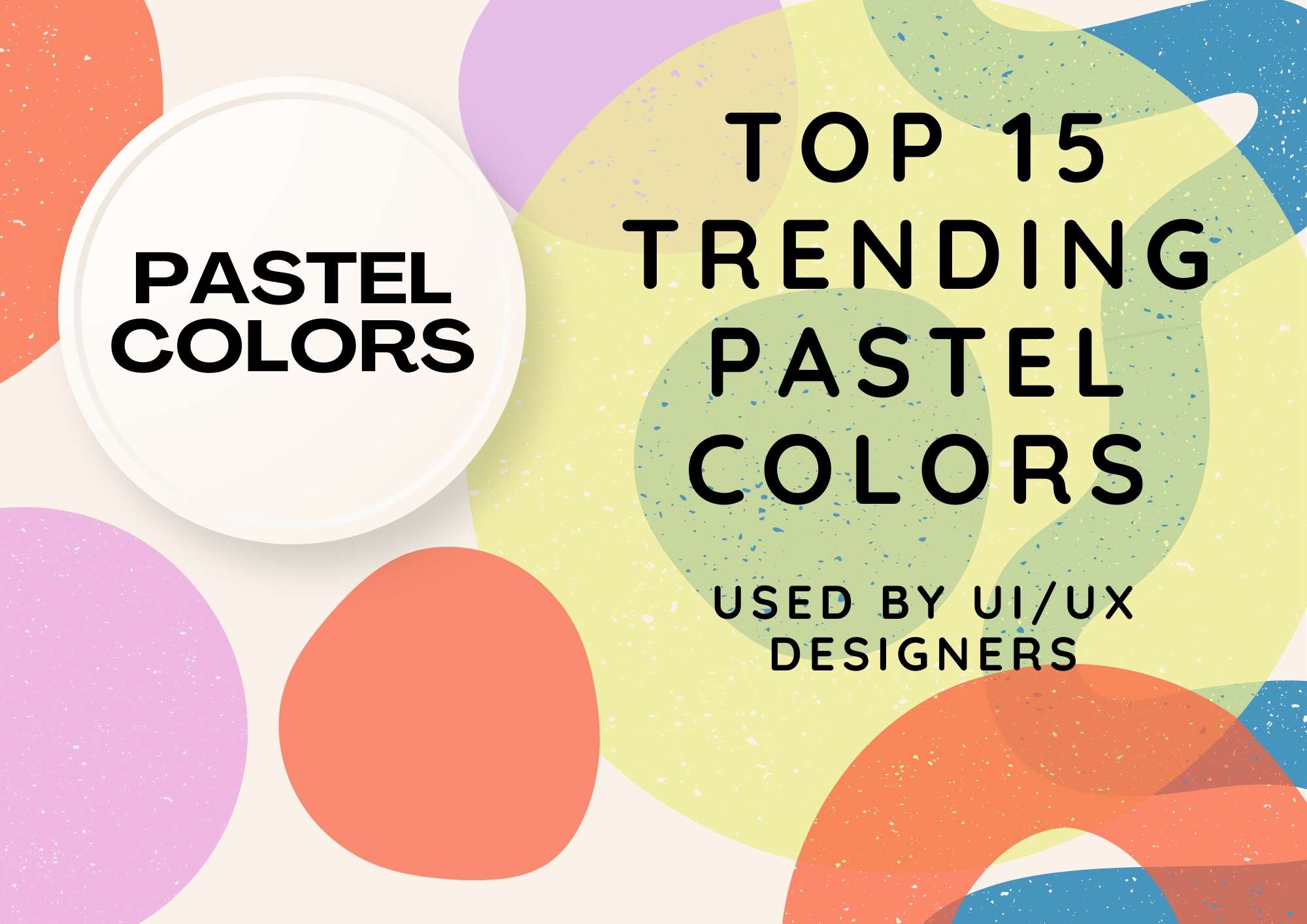
Let’s explore the top 15 trending pastel colours in 2025 for UI/UX designers and learn how these pastel shades were used strategically to create visually stunning, accessible, and emotionally engaging designs that elevated user experiences.
Introduction
In 2025, there will be more demand for pastel colours. In my career of about 20 years, the demand for soothing and calm colours keeps increasing. As a UI/UX designer, I have witnessed the evolution of design palettes, from stark minimalism to vibrant gradients. But pastel colours stand out due to their quality of perfectly balancing softness and elegance.
Pastel colours help in creating user-friendly designs that work well across various industries like fashion, cosmetics, interior designing, printing, graphic designing, photography, and children’s items.
In this blog, I’ll share 15 trending pastel colours of 2025 and explain to you how to use them effectively in your designs. Pastel colours can add a fresh and modern touch to your designs, whether related to branding, user interfaces, or wanting to increase user experience.

- Blush Pink
- Hex Code: #FADADD
- Inspiration: Soft and romantic, perfect for delicate designs.
- Mint Green
- Hex Code: #98FF98
- Inspiration: A refreshing, cool pastel with a modern touch.
- Lavender Purple
- Hex Code: #E6E6FA
- Inspiration: Calming and elegant, often used for serene aesthetics.
- Sky Blue
- Hex Code: #87CEFA
- Inspiration: Light and airy, reminiscent of clear, open skies.
- Peach Orange
- Hex Code: #FFDAB9
- Inspiration: Warm and inviting, perfect for soft yet energetic designs.
- Powder Yellow
- Hex Code: #FFFACD
- Inspiration: Cheerful and sunny, ideal for uplifting compositions.
- Seafoam Green
- Hex Code: #B2F2BB
- Inspiration: Cool and soothing, evoking a fresh coastal vibe.
- Baby Blue
- Hex Code: #A2D2FF
- Inspiration: Gentle and calming, often used for dreamy visuals.
- Soft Coral
- Hex Code: #FBC4AB
- Inspiration: A delicate mix of pink and orange, exuding warmth.
- Cream White
- Hex Code: #FFFDD0
- Inspiration: Subtle and elegant, ideal as a base pastel tone.
- Pastel Lilac
- Hex Code: #D8BFD8
- Inspiration: A soothing and mystical hue for creative projects.
- Pale Aqua
- Hex Code: #AFEEEE
- Inspiration: Calm and refreshing, perfect for tranquil designs.
- Dusty Rose
- Hex Code: #F4C2C2
- Inspiration: Romantic and vintage, a timeless pastel colour.
- Periwinkle
- Hex Code: #C5CBE1
- Inspiration: A balanced mix of blue and purple, exuding serenity.
How to Use Pastels Strategically in UI/UX
Backgrounds and Gradients
Since pastel colours are calm and near neutral. That makes them excellent background colours, providing a soft canvas space for other UI elements. On top of this surface, you can combine them in gradients to create depth while maintaining softness.
Contrast and Accessibility
As we know, pastels are gentle on the eyes, so ensure sufficient contrast by pairing them with darker tones or using them sparingly for text. Later, you can use tools like Contrast Checker to ensure compliance with WCAG guidelines.
Micro-Interactions and Hover States
Adding pastel shades in the interactions, like the hover states of a button, adds a user’s engagement in the form of button animation or the appearance of a message on successful transactions.
Typography Pairing
Pastel colours create a modern and elegant look in typography as well. You can use them with clean sans-serif fonts to title a page or share minimal content. Bold text colour contrasting with the pastel background colour creates a modern and elegant look.
Brand Identity
While creating a company logo, icon, or style guide, you can use pastels to ensure a timeless appeal.
Case Study: Pastels in Action

In a recent redesign project for a fitness app, I utilised Mint Frost (#D4F0E5) as the primary background colour, complemented by Dusty Rose (#EFCAD2) for action buttons and Cream Yellow (#FFF4CC) for highlights. The result? A soothing and intuitive interface that boosted user engagement by 35%. By leveraging pastels, we created an environment that felt approachable and inclusive.
Conclusion
As a seasoned designer, I see the potential of pastel colours in crafting user experiences in 2025. These are more than a brand; they are a design philosophy. By integrating these 15 trending pastels, you can create visually appealing designs that will be accessible and emotionally resonant. This learning will also help you to boost your career in UI/UX designing.
Pastels offer a spectrum of possibilities when you are designing for websites, mobile apps, or brands. You must embrace their subtle power and let them transform your creativity. You can easily create and explore the trending pastel colours at coolers website.
Let me know how you use pastel colours in your creation in the comments box below. That will be an insight for me.