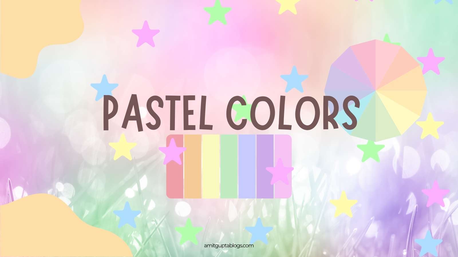
Pastel colors have light, soft and soothing shades because they are made with a mix of white color, which reduces their intensity and gives a soft and refreshing feel. You can say that pastel colors are primarily white colors with a hue of a particular color mixed in them and are known as a tint of its hue.
These colors have a subtle and calm look. The colors like light pink, baby blue, lemon yellow, Ice blue, mint green, lavender, and peach, are examples of pastel colors.
Table of Contents
Why Use Pastel Colors in Web Design?
Pastel colors are used in web designing because they give a soft, calm and eye-friendly feel. These colors create a comfortable and relaxing experience for users, which makes a website more engaging and approachable.
Apart from this, pastel colors are also popular in fashion, home interior decoration and artworks.
- Attractive and unique look
- Pastel colours are not as overpowering as vibrant colors, hence these colors give a subtle and stylish look. It makes the website modern and fresh. That is why users like it more.
- Easy on the Eyes
- Since these pastel colors are subtle and soothing, users can spend more time exploring the website. Vibrant colors are harsh which can be stressful for the eyes of your website users and can prevent traffic from coming to your website.
- Professional and Calm Vibe
- If your website is related to education, art, health and fitness, then pastel colors are a perfect choice to give your website a professional, calm and feel of relaxation.
- Flexibility
- The flexibility of pastel colors is that they mix well with a variety of wood and natural material tones. Pastel colors can easily blend with any design, be it minimalist or artistic. These shades are also ideal for typography and backgrounds.
- Stay in trend
- Pastel colors have become a popular trend in web design. They can create a calming and welcoming atmosphere for your website users.
Psychology of Pastel Colors
As you know pastel colors are a blend of more white and a pinch of hues. Here’s why many people think of pastel colors as bland and dull, but they are aesthetically pleasing and can liven up a design. Patel colors can also be used to communicate a specific message to your target audience.
Why do some colors make you angry while some make you calm, hungry, relaxed. Some colors bring joy, charm, and freshness.
Let us explore the psychology of these pastel colors with the following points:
- Calmness and relaxation
- Pastel colors are less saturated than original colors, which gives them a more calming effect. Colors such as light blue and mint green, reduce stress and create a soothing atmosphere. So they are perfect for wellness and meditation websites or spaces.
- Positivity and happiness
- Pastel colors, such as baby blue, peach, pale yellow and baby pink, are nursery colors that give positive and cheerful vibes. These colors give a feeling of happiness and warmth. Due to this these colors are children’s friendly and are also used in branding, marketing, packaging and digital art.
- Softness and femininity
- Colors such as lavender and blush pink represent softness and femininity. They are quite used for fashion, beauty and child-focused designs. These colors evoke romantic feelings too when combined with romantic imagery.
- Playful and fun vibes
- Pastel yellow and light orange give a playful and friendly feel, which is quite effective for children’s products or websites.
- Neutral and Balance
- Pastel shades create a balance that doesn’t feel harsh or loud and makes any space or design feel neutral and easy on the eye.
- Emotional Comfort
- These shades are very soothing, and bring a welcoming and safe feeling, so they are very popular in therapy or wellness platforms.
Examples of Pastel Color Palettes
As Pastel colors are less saturated than primary and secondary colors, making them feel light, soft, and calming. These colors are usually described as soft, desaturated, neutral, washed out and soothing. Some of the colors are listed below that can go well with your ideas for website designing, branding, packaging, or marketing.
Download: PDF version of this Pastel colors palettes

Take Away
Pastel colors have unique color psychology. Pastels are so adaptable that you can use them however you want. The beauty of pastels lies in their inherent versatility. Unlike bold and vibrant colors that have specific complementary palettes, pastels can be freely combined to create a variety of moods. No matter how you choose to use them, pastels provide a powerful design tool with the ability to evoke positive emotions and create visually appealing experiences.
Let me know how you use pastel colors in your designs, create your portfolios and so?